
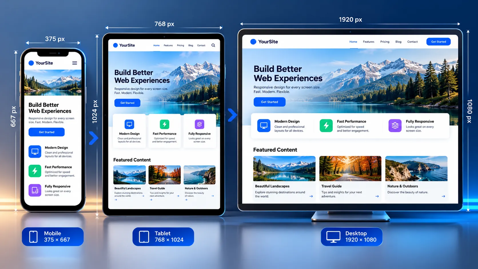
Enter a webpage URL, choose a viewport size, and preview how the page responds across mobile, tablet, laptop, and desktop dimensions. The Webpage Screen Resolution Simulator lets you test custom width and height values directly in your browser, making it easier to spot responsive layout problems before they reach users.
Test a Website at Different Screen Sizes
Responsive layouts can behave very differently when the available viewport becomes narrower or taller. A page that looks correct on a desktop monitor may develop horizontal scrolling, cramped navigation, overlapping content, awkward text wrapping, or poorly positioned buttons on smaller viewports.
Use the simulator to:
- Preview a webpage at common mobile, tablet, laptop, and desktop viewport sizes
- Enter exact custom width and height dimensions
- Switch between portrait and landscape orientation
- Zoom the preview when a large viewport does not fit comfortably on screen
- Check responsive breakpoints and layout changes
- Inspect how content reflows as available space changes
- Open a page in a new browser tab when iframe embedding is blocked
- Use fullscreen mode when you need a larger testing workspace
The tool works in the browser without requiring an account, sign-in, or server-side webpage screenshot service.
Screen Resolution vs. Viewport Size: What Are You Actually Testing?
The terms screen resolution, screen size, and viewport size are often used interchangeably, but they are not technically identical.
For responsive web design, the CSS viewport is especially important because CSS media queries respond to viewport dimensions. For example, a layout can change from multiple columns to a single column when the viewport becomes narrower.
Modern browsers can also have device pixel ratios, browser UI, zoom settings, and other factors that mean a device’s physical pixel resolution does not directly equal its CSS viewport size. MDN documents viewport dimensions and CSS viewport behavior in detail. MDN: CSS viewport
That is why this simulator should primarily be treated as a viewport and responsive-layout testing tool, rather than a hardware emulator.
How to Use the Webpage Screen Resolution Simulator
1. Enter the webpage URL
Paste the full URL of the webpage you want to inspect.
For example:
https://example.com/The target page needs to be accessible to your browser.
2. Choose a viewport preset
Select an available desktop, laptop, tablet, or mobile preset.
Presets make it quick to check common viewport configurations without manually entering dimensions every time.
3. Use custom dimensions when necessary
For breakpoint testing, a preset is not always enough.
Enter an exact width and height when you want to test a particular CSS breakpoint, reproduce a reported layout problem, or inspect an unusual screen configuration.
For example:
Width: 768 px
Height: 1024 px
You can also test dimensions immediately around a breakpoint to see exactly when a layout changes.
4. Rotate the viewport
Use portrait and landscape orientation when testing responsive layouts.
This is particularly useful for:
- Mobile navigation
- Tablet layouts
- Image galleries
- Wide tables
- Forms
- Hero sections
- Two-column layouts
- Fixed or sticky interface elements
5. Inspect the result
Look for changes in:
- Navigation
- Headings
- Text wrapping
- Images
- Cards
- Buttons
- Forms
- Tables
- Columns
- Padding and spacing
- Horizontal overflow
- Content hidden below the fold
The goal is not simply to ask whether the page “looks smaller.” The useful question is whether the layout continues to work when its available viewport changes.
Why Responsive Viewport Testing Matters
CSS media queries allow developers to apply different styles based on viewport characteristics such as width and height. They are a fundamental part of responsive web design. MDN: CSS media queries
A small change in available width can therefore trigger a major layout change.
For example:
| Viewport condition | Possible layout behavior |
|---|---|
| Wide desktop | Multi-column layout |
| Medium laptop | Reduced spacing or fewer columns |
| Tablet | Navigation or content stacking |
| Narrow mobile | Single-column layout |
| Landscape mobile | Wider horizontal layout with limited height |
Testing only the screen you currently use can leave important responsive states unchecked.
What Problems Can a Screen Resolution Simulator Reveal?
Horizontal scrolling
A fixed-width element may extend beyond the viewport and create unwanted horizontal scrolling.
Common causes include:
- Fixed-width containers
- Oversized images
- Long unbroken strings
- Wide tables
- Components with excessive minimum widths
Navigation overflow
Desktop navigation may fit comfortably at a wide viewport but become crowded when the width decreases.
Check whether the design:
- Collapses navigation appropriately
- Wraps content unintentionally
- Hides important links
- Causes buttons to overlap
Unexpected text wrapping
Headings, buttons, labels, and paragraphs can change dramatically when their available width decreases.
A heading that occupies one line on desktop may become four lines on mobile and push important content further down the page.
Cramped cards and columns
A grid that works at 1440px may become difficult to use at 768px or 390px.
Check whether columns collapse at sensible points instead of becoming excessively narrow.
Images extending beyond the viewport
Images with fixed dimensions can create overflow on smaller screens. Responsive images should generally be allowed to shrink within their containing space. web.dev recommends sizing images so they can fit within the viewport. web.dev: Responsive web design basics
Test Breakpoints Instead of Only Testing Devices
A common mistake is to test only named devices.
Responsive CSS does not fundamentally care whether the visitor owns an “iPhone,” “tablet,” or “laptop.” What matters for many layout decisions is the environment reported to CSS, including viewport width.
For example, if a design changes at:
@media (max-width: 768px) {
    /* mobile layout */
}
testing exactly around that threshold can be more informative than testing only a popular device preset.
Try:
- 767px
- 768px
- 769px
If the layout changes at 768px, these three tests can expose a breakpoint transition that a simple device checklist may miss.
MDN describes viewport width as the basis for width-related media queries and supports testing exact, minimum, and maximum viewport widths. MDN: CSS width media feature
A Practical Responsive Testing Workflow
For a new landing page, redesign, or major CSS change, use a sequence rather than checking one screen size.
Start with a narrow viewport
Check the smallest practical layout first.
Look for:
- Horizontal scrolling
- Broken navigation
- Oversized headings
- Buttons extending outside containers
- Images exceeding available width
- Content becoming difficult to read
Move through the major layout transitions
Increase the viewport width gradually.
Watch for the points where:
- Navigation changes
- Columns appear
- Cards resize
- Sidebars become visible
- Typography changes
- Containers reach their maximum width
Check the desktop layout
At larger widths, look for the opposite problem: excessive whitespace, stretched content, overly wide text lines, or components that fail to use available space effectively.
Test orientation
Rotate mobile and tablet dimensions.
A design that works in portrait can still fail when the available width suddenly increases while the viewport height decreases.
Why a Simulator Is Not the Same as a Real Device
A browser-based viewport simulator is useful, but it should not be described as a perfect replacement for physical-device testing.
A viewport preview does not reproduce every characteristic of a particular physical device.
Important differences can include:
- Device pixel ratio
- Physical display characteristics
- Browser engine differences
- Operating-system rendering
- Touch interaction
- Mobile browser interface
- Keyboard behavior
- Safe-area insets
- Hardware performance
- Network conditions
- Installed fonts
- Accessibility settings
The simulator is therefore best used for responsive layout and viewport QA, followed by real-device or browser-based testing when those additional characteristics matter.
One Important Limitation: Some Websites Cannot Be Embedded
The simulator loads webpages inside a browser preview frame. Some websites intentionally prevent other websites from embedding their pages using security policies such as X-Frame-Options or Content Security Policy (frame-ancestors).
When this happens, the simulator cannot bypass that restriction.
If a target website refuses iframe embedding, use the available Open in New Tab option and test the page directly in your browser instead.
This is an intentional browser security boundary, not a simulator failure that should be bypassed.
Does the Tool Upload My Website?
The simulator is designed around browser-side viewport previewing rather than a server-side screenshot or rendering service.
There is no need to upload your webpage files to PKCapra simply to change the preview dimensions.
However, when you enter an external URL, your browser still has to request that URL from the target website. The target website’s own network, security, cookies, authentication, and embedding policies therefore remain relevant.
Do not interpret “browser-based” as meaning that the target URL itself is never contacted.
Who Can Use a Webpage Screen Resolution Simulator?
This tool is useful for:
- Web designers
- Front-end developers
- WordPress developers
- SEO professionals
- QA testers
- Agencies
- Website owners
- UI/UX designers
- Content teams reviewing landing pages
It is especially useful when you need a quick visual check without repeatedly resizing the main browser window.
For broader technical website checks, you can also use PKCapra’s Page Speed Analyzer to investigate performance-related issues and the Mobile SEO / Mobile-First Analyzer for mobile-focused SEO checks.
Screen Resolution Testing Checklist
Before considering a responsive page ready, check:
- Mobile portrait layout
- Mobile landscape layout
- Tablet portrait layout
- Tablet landscape layout
- Laptop viewport
- Desktop viewport
- Custom breakpoint widths
- Navigation behavior
- Heading wrapping
- Button and form layout
- Image scaling
- Card and column stacking
- Horizontal overflow
- Above-the-fold content
- Sticky and fixed elements
- Long text and unusual content
- Real-device behavior where final QA requires it
Frequently Asked Questions
What is a webpage screen resolution simulator?
A webpage screen resolution simulator is a browser-based tool that lets you preview a webpage inside selected viewport dimensions. It is primarily useful for checking responsive layout behavior across different widths and heights.
Can I test a custom screen size?
Yes. Custom width and height values allow you to test dimensions that are not included in the standard presets.
Is screen resolution the same as viewport size?
No. Physical screen resolution and CSS viewport dimensions can differ because of device pixel ratio, browser behavior, zoom, and other factors. Responsive CSS commonly responds to viewport dimensions rather than simply the physical pixel count of a display.
Can I test mobile and tablet layouts?
Yes. Mobile and tablet presets, along with portrait and landscape orientation, allow you to inspect how the layout changes as the available viewport changes.
Why won’t some websites load in the simulator?
The target website may prohibit iframe embedding through security headers or Content Security Policy. A browser-based simulator cannot and should not bypass those restrictions.
Does the simulator replace testing on a real phone?
No. It is a fast responsive-layout testing aid, not a complete physical-device emulator. Real devices remain useful for validating touch behavior, browser differences, performance, accessibility, and other device-specific conditions.
Should I test only popular device sizes?
No. Testing around your actual CSS breakpoints can be more valuable than checking only named devices. Custom dimensions make it possible to reproduce specific layout conditions.
Final Takeaway
A responsive website should not be judged only by how it looks on the screen in front of you. The available viewport changes continuously across phones, tablets, laptops, desktops, orientations, browser windows, and user settings.
Use the Webpage Screen Resolution Simulator to quickly test those layout conditions, identify obvious responsive problems, and investigate breakpoint behavior. For final quality assurance, combine viewport simulation with real-device testing and broader performance, accessibility, and usability checks.